🗓️ When: Thu, 9 May - Sun, 12 May.
📍Where: Brisbane Showgrounds Exhibition Building, 600 Gregory Terrace, Bowen Hills QLD.
Get your tickets via Affordable Art Fair

Art collecting is the perfect way to create a unique and personalised space. But where to start? Limited edition art prints can be an excellent choice for first-time collectors, a great way to add to existing decor and they make lovely gift. Limited edition prints are reproductions of an original artwork, created in a limited quantity, which gives them a level of rarity and exclusivity.
Open Vs. Limited
Limited edition prints are available in a set number only. Because of their exclusivity, limited edition prints are more valuable and more expensive than open edition prints. When an artist sells open edition prints, there’s no predetermined limit on how many prints will be offered. It's good to remember however, this does not mean that an open edition art print will be available indefinitely.
Limited edition prints are available in a set number only. Because of their exclusivity, limited edition prints are more valuable and more expensive than open edition prints. When an artist sells open edition prints, there’s no predetermined limit on how many prints will be offered. It's good to remember however, this does not mean that an open edition art print will be available indefinitely.
Surfaces
When it comes to surfaces, canvas prints are perfect for those who love the look of paintings, while fine art paper prints are ideal for those who prefer a natural white matte finish. Our canvas prints are created high-quality bright white canvas, which is then affixed to hand-cut, eco-friendly wooden stretcher bars. Our canvas prints come ready to hang or frame as you wish. Our paper prints are made using natural white archival quality matte paper.
Limited edition art prints provide an affordable way to own a unique piece of art that speaks to you. Whether you're a first-time collector or an experienced one looking to expand your collection, these prints offer a level of exclusivity and rarity that can make them valuable over time. By selecting prints that resonate with you, you can create a collection that reflects your personal style and taste, and adds character and depth to your living space.
When it comes to surfaces, canvas prints are perfect for those who love the look of paintings, while fine art paper prints are ideal for those who prefer a natural white matte finish. Our canvas prints are created high-quality bright white canvas, which is then affixed to hand-cut, eco-friendly wooden stretcher bars. Our canvas prints come ready to hang or frame as you wish. Our paper prints are made using natural white archival quality matte paper.
Limited edition art prints provide an affordable way to own a unique piece of art that speaks to you. Whether you're a first-time collector or an experienced one looking to expand your collection, these prints offer a level of exclusivity and rarity that can make them valuable over time. By selecting prints that resonate with you, you can create a collection that reflects your personal style and taste, and adds character and depth to your living space.

In the world of design, Pantone's Color of the Year acts as a trendsetter, shaping choices from fashion runways to home interiors. This year, Peach Fuzz takes center stage, casting a velvety, gentle peach tone that exudes warmth and modern elegance.
What's all the fuzz? Have you ever noticed how stores all seem to embrace similar colours at once? Influencers like Pantone, with their annual colour selections, effectively set the mood for design, fashion, and homewares, influencing what we see on shelves and runways alike.

I love incorporating peachy tones particularly into beach abstracts because it beautifully mimics the warmth of sand. The gentle, sun-kissed hues evoke the tranquility of coastal scenes, creating a harmonious blend with the blues of the sea, like this stunning image from SA From Above demonstrates.

Now for the fun bit! I have a new limited edition print "Peach Sorbet," a vibrant limited edition print featuring swirling peachy brushstrokes adorned with delicate white details. Grab one of the five exclusive prints while you can! And that's not all. Head over to the website to snag some free downloadable gift tags inspired by peach fuzz. Add an artistic touch to your Christmas and beyond.


 Why Develop an Artistic Palette? An artistic palette is a set of colours that an artist uses in their work. It can be as simple as a few favorite colours, or as complex as a carefully curated selection of hues that work together to create a specific mood or atmosphere. There are many reasons why an artist might want to develop an artistic palette. For some, it is a way to create a consistent look and feel in their work. For others, it is a way to express their personal style or artistic vision. And for still others, it is a way to connect with their surroundings and evoke a sense of place in their art.
My own artistic palette has evolved over time, influenced by the diverse landscapes I've had the privilege to explore. At the start of my career I moved to New Zealand. The soft, cool hues of New Zealand's breathtaking mountains and lakes quickly found their way onto my canvas. In fact for over eight or more years I produced work in nothing but blue or grey! After I moved to Europe, tranquil greens and blues were introduced on occasion, but when I returned to Australia it was pretty clear the cool blues and greys just didn't match with what I was now seeing.
Australia is a country of extremes, with sun-drenched coastlines, fiery red outback, lush rainforests, and parched bushland. I wanted my art to reflect that beauty and diversity.
Gradually, I've been crafting a colour palette that encapsulates the spirit of my surroundings. I've incorporated the azure waves of the ocean, the soft blues of the sky, the fiery reds of the outback, and the vibrant greens of the rainforest. I've included the earthy tones of the bushland and the subtle hues found within the leaves of eucalyptus trees.
As artists, we are constantly experimenting and refining our palettes, but I'm happy with the direction mine is headed in. I recently took a colour mixing class that has allowed me to explore new possibilities and deepen my understanding of the colours I use in my artwork.


Water ripples are the perfect subject for an artist, offering an endless array of shapes and forms to explore. With each body of water having its own unique characteristics, such as the size and shape of the water, the intensity and direction of the wind, and the presence of any objects in the water, water ripples can take on a countless number of forms.
In still water, the ripples often appear as elegant concentric circles that radiate outwards from a central point. These circles can become distorted or elongated if there's a rock or other object creating a disturbance in the water. In rough water, such as in the ocean, the ripples can become more unpredictable, forming wild peaks and troughs that crash against each other.
The interplay of light and water ripples creates stunning visual effects. As the ripples move, they reflect and refract light, creating a dynamic dance of colours and textures. Depending on the angle of the light source and the viewer, the ripples can appear to shimmer, sparkle, or even glow.
As an artist, capturing the unique patterns and shapes of water ripples can be both challenging and rewarding. I'm happy to share my latest work but I'm far from done exploring this subject. So stay tuned for more pieces to come!

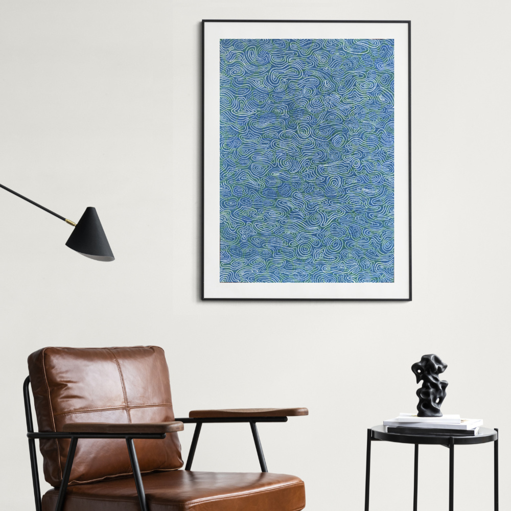

I wanted to share quite a good video I came across today showing some of the symptoms of visual snow syndrome which is the neuro-ophthalmologcal condition I have. I get a lot of comments and questions about why my work is so dotty or why the circles, why the pattern etc? Hopefully this goes some way to explaining it. Top: Visual snow vision Bottom: Normal vision
I also mocked up a couple of images (above) to try and show a little of how it appears when my eyes are open. Just try to imagine all those little tiny dots moving around and flashing occasionally.
I'm planning a new body of work exploring this a little more and hopeful it will raise some awareness of the condition too, many people who develop this, rather than being born with it like me, are really struggling and doctors are still trying to find a cause let alone a cure.

 |  |

The original art material, paper has long been a staple for practising artists. It is often the first thing artists reach for when they want to create. However paper’s usefulness goes beyond a surface to draw on. In Play with paper, artists exploit paper to push the medium to its limits. Through tearing, moulding, folding, marking and assembling, the works will present new ways of seeing and thinking about working with paper.
 |  |
I liked this statement from the exhibition which I think explains quite well why I enjoy working with paper so much: Paper makes the world go round. The backbone of the modern world, paper holds knowledge in the form of books, stimulates economies through currency and communicates ideas between people. A blank sheet of paper can be a terrifying concept but it also presents a world of possibilities. Paper's versatility makes it the perfect medium for artists wanting to experiment by cutting, folding, tearing, burning, crumpling, gluing and assemblage.
 |  |
 |  |

This year I've set myself the challenge of going more three dimensional with my work, particularly with the landscapes. It was also nice to try and work with a different colour palette for a landscape with the pinks and greens.
They will be on show at Aspire Gallery next month 1 - 15 February as part of Petite Pieces 2017.
53 Kennedy Terrace Paddington


If you follow any of my social media accounts like Facebook and Instagram, you've probably noticed a lot of blue and white lately. Last month I was busy getting ready for a group exhibition at the Aspire Gallery in Brisbane's Paddington. The theme was 'comforts of home' and I took it as an opportunity to resurrect some old ways of working as wall as learning some new skills.
Having spent a significant portion of my life traveling I was interested in exploring what images might represent home when I've had so many different ones. I decided to narrow it down the most recent few cities, adopting a very homely subject of chintz fabric, patchwork and china plates.

Using different floral and bird motifs I created individual artworks to represent a home city and country. The passion fruit to me is Brisbane, Sydney the frangipani, London a rose and Wellington a Kawhai. The birds are a Rainbow Lorikeet for Australia, Wren for England and Tui for New Zealand.
Using antique illustrations as a starting point I recreated the flowers and birds from security envelope lining, then grouped them together to form a chintz 'fabric' pattern. It was my first attempt at making a repeatable pattern and is definitely something I'd like to try again.
I printed the pattern in large format then cut it into piece along with more security envelope lining to create a large paper patchwork. I then went back to the individual floral images and created blue and white china plate designs. It was nice to go back to working with porcelain again, something I used to use a lot in my NZ gallery. This time rather than hand painting I was able to transfer my designs directly from the printer onto the plates. There are also limited edition prints of these pieces on lovely glossy paper.